


Miller Center's Problem
The accelerator’s deliverable tracker needs a redesign, as its interface and functionality is creating friction for users.
~ 42%
of users reported confusion when navigating the deliverable tracker.
~ 38%
of mentors consistently updated their work plans in the dashboard without prompting.
~ 29%
increase in mentor support requests related to the tracker during cohort cycles.


Goal
Revamp the deliverable tracker feature for the accelerator program in order to:
Simplify the user interface to make the tracker more intuitive and easier to navigate.
Integrate key features to reduce reliance on external tools, creating a more efficient workflow.
Improve the tracker by adding new features for better collaboration between groups.
Research
The primary user groups identified were mentors and entrepreneurs actively participating in the program.
Pain points included:
User Interface - the tracker is difficult to navigate, leading to wasted time with users.
Functionality - lacks essential features like which deliverables are mandatory for entrepreneurs.
Workflow - users find assigned deliverables and deadlines are unclear or hard to manage.
Integration - using multiple external tools with the dashboard causes confusion for mentors.
%20(11%20x%208%20in)%20(8%20x%208%20in)(8).png)
Ideation in the Design Process

Approach
I focused on integrating external tools into the redesigned dashboard to centralize the workflow for creating accelerator work plans. This approach aimed to reduce tool-hopping and enable smoother collaboration between entrepreneurs and mentors.
Some feedback from rounds of usability testing included:
Mentors want the ability to assign individual deadlines to each deliverable.
Users want a completion percentage to see their progress on the work plan.
Entrepreneurs want a clear visual distinction between mandatory and optional deliverables.
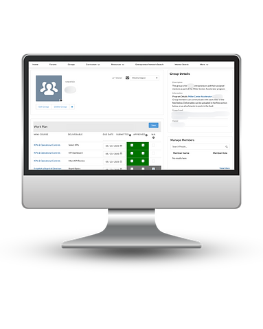
Finalized Work Plan Dashboard

Results & Retention
Impact
After launching the redesigned work plan dashboard, the accelerator team tracked its impact over the next two cohorts. The data revealed improved accuracy in customized work plans, with participants now having more options to tailor their deliverables to reflect their unique business needs. Mentors and entrepreneurs also reported significantly less confusion when using the tool. Overall, the new dashboard’s success demonstrates its effectiveness in streamlining workflows and improving collaboration between program participants.
As of 1 year post rollout:
35% decrease in mentor support requests related to work plan deliverables.
25% increase in weekly usage of the accelerator work plan dashboard.
32% reduction in time required to assign work plan deliverables for each group.
